Hey hey friends! We hope you guys are enjoying watching us tackle this flip house! We are just a few short weeks away from completion and showing y’all the final reveal and we can’t even wait.
Look at how pretty she is!! And… did I mention ALMOST DONE?! Yeah!

We get SO many questions about the flip house paint colors, and we wanted to put it all here in one place to make it easy for you! Sometimes picking paint colors is like picking baby names… Why is it so dang hard?!
We worked with one of our favorite brands on the flip house for paint, Sherwin-Williams. They have been our top paint choice for many years now, and we knew that’s who we wanted to use for this home. Let’s start with the interior!
We wanted a very neutral background, so we chose to go with one of our favorite whites. This is called Pure White SW7005. For the walls we used a product called Cashmere which is an acrylic latex paint. We used a flat finish, which may sound scary and hard to keep clean. But, with this specific product, it’s a very soft finish with just a hint of sheen to it. It’s also easy to clean. I put the same white paint and finish in my dining room a few months ago, and LOVE it.


We also used Pure White on all the trim, doors and baseboards. We used an enamel paint for this. I have used both oil base and acrylic latex on trim in my house, and both do well. Oil base paint does hold up to wear and tear just a little bit better, and it also sprays on super smooth making it the first choice for our painter. We used
In the kitchen, we also used an enamel paint on the cabinets. We chose to use the color called Dorian Gray SW7017. It’s the perfect grey if you are looking for just a hint of warmth. It doesn’t go blue like so many grays tend to do when paired with a warmer white. We love the combination with the Pure White walls and mixes of wood we used throughout this space.
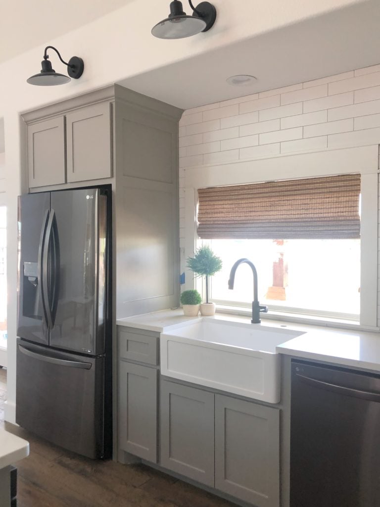


We used the same color in two of the bathrooms upstairs. Those bathrooms have really pretty faux wood tile floors, and the gray is perfect against them. We also love the dark grey quartz countertops with against the softer Dorian Gray. PERFECTION!

In the master bath and laundry room we used Pure White on the cabinets also in the enamel paint. We wanted these spaces light and bright, and the white on white with the darker countertops and tile mixes came together perfectly.

While everything is white and gray and neutral, it still feels very warm and cozy which is what we were looking to achieve!
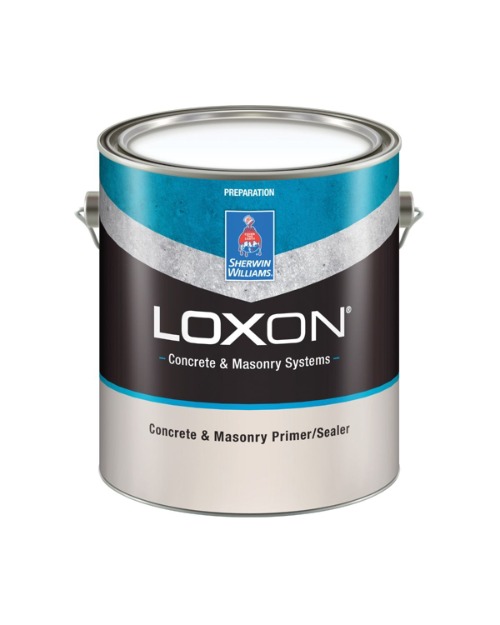
Now let’s move outside! Talk about a transformation! We couldn’t be happier with how this turned out. One challenge we faced was having the existing brick mesh well with the new board and batten. We decided early on that painting the brick would be a great way to have the two pair up. Because we were painting the brick, we first used a primer to prep the surface. For this we used Loxon Contrete and Masonry Primer and Sealer.
The white paint we used as our top coat is called Dover White SW6385. I do believe that this white looks much more white in person. We wanted a warm white that wouldn’t be too stark with our trim color, and would blend well with the cedar accents. This color hit the nail on the head. The product we used is called Emerald Exterior Acrylic Latex. It went on super thick! We used a Satin finish.

For the trim, we used Tricorn Black SW6258. We love the contrast against the white and it’s perfect with the cedar accents. The paint product we used on the trim was Emerald as well, the same we used for the brick paint.

So, what do you think?! We are loving how it’s coming together, and can’t wait to reveal it to you over the next few weeks! Be sure to subscribe to our YouTube channel so you don’t miss the next episode! Also, go follow Sherwin-Williams on Instagram for some great paint color inspiration!

What are the countertops in the kitchen? And where did you get them? Looks amazing!
what color is the roof?
Did you paint the garage doors? If so what paint did you use and any special techniques?
Humm! Hello?! What are the names of the (2) wallpapers featured? The first one in the living room on the fireplace and then the splash area in the kitchen at the oven hole?
I am in love with your house! Do you mind sharing where you go the exterior lights?
Looks great!!
Love, love, love every choice!
Wow! Love it! Thanks for sharing. I would be afraid to use a white in such a big space for fear it would be too stark, but it is truly calming and creamy.
What stain color did you use on the boxes? Thank you!
What color stain did you use on the exterior wood