Hey everyone! I’m back with another house update and this one is super fun! Paint color choices! I had fun with this one because it is not permanent! If you follow us on Instagram, you probably saw a little sneak peak of one of the rooms. It’s always tough to pick paint colors and it would have been so helpful if I had room images of all of my paint choices. So, in an effort to help all of you paint shoppers, I am sharing mine 🙂
I went to Lowe’s and picked out Valspar for all of our interior and exterior paints. For the interior, I chose Valspar Signature with the paint and primer in one and it looks great!! (I chose satin so that I could wipe the walls clean – two teenage boys and a toddler can do some major wall damage 😉 ) For the exterior, I went with Valspar Duramax, also a paint and primer in one and chose eggshell for the sheen.
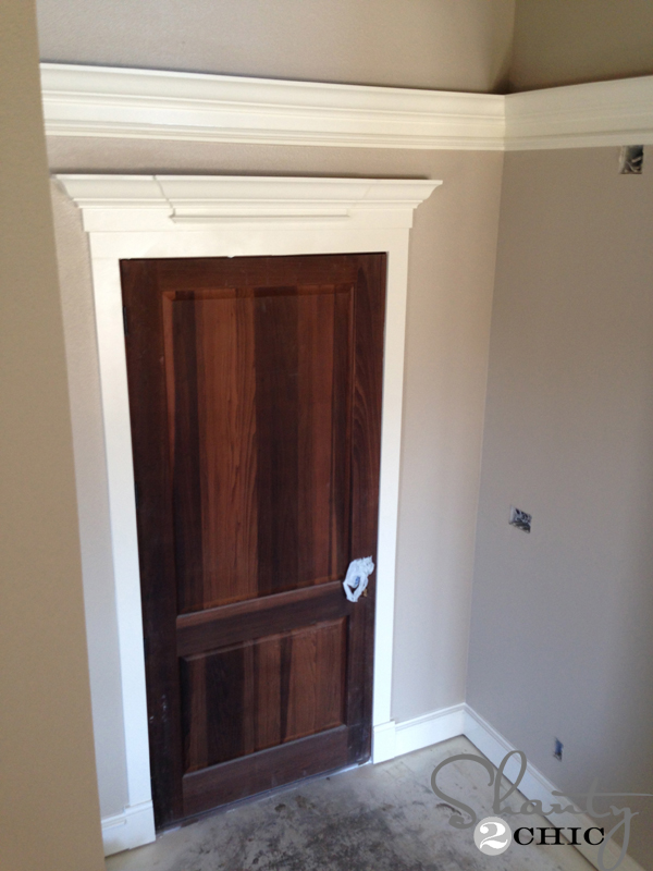
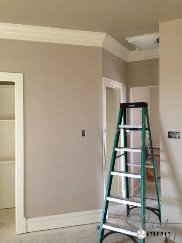 So, all of the rooms in the house minus the bedrooms will be this yummy neutral – Fairmont Penthouse Stone. It’s a perfect “greige” and it is so warm feeling without darkening a room.
 Here’s another shot of it in our entry.
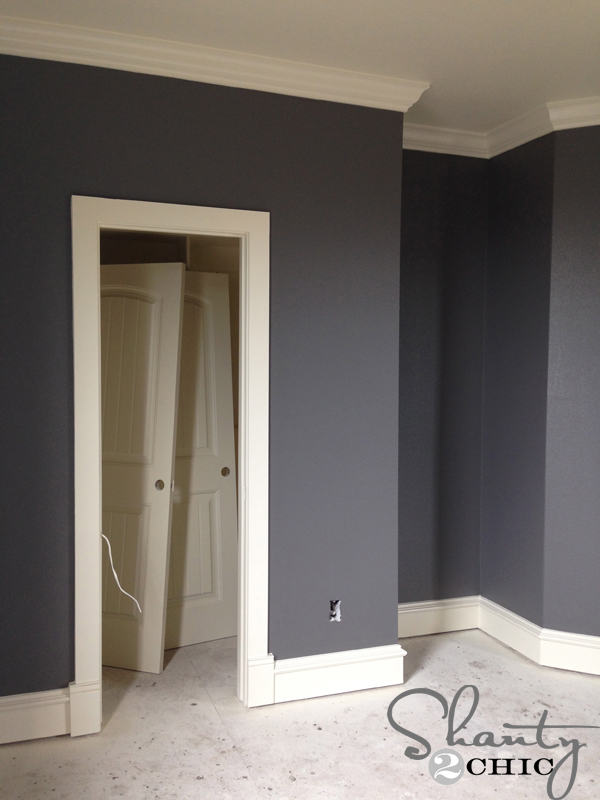
 Now one of my FAVORITE choices is Seine! I liked it so much that it is in one of our boys rooms…
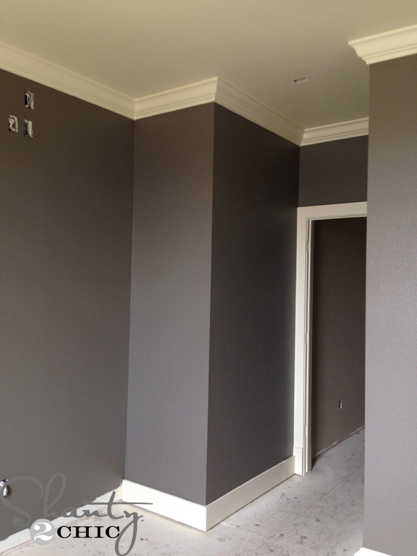
 and our master. The hubs liked it so much that he chose it for his study! Since it is a darker color, I opted to paint the ceilings with Ivory Lace. We also had all of our oil-based trim paint tinted to match Ivory Lace.
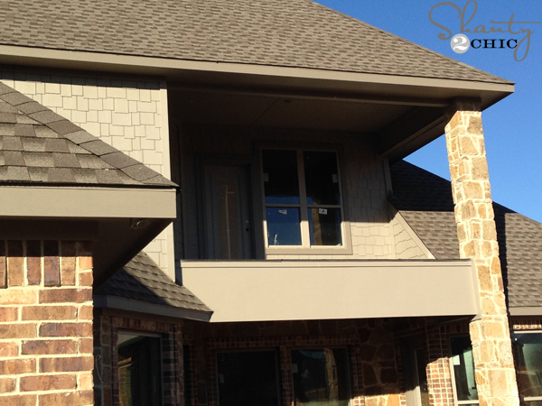 We also used it on the exterior to trim our roof line and around our windows. The lighter color in this pic (on the staggered edge siding) is Coastal Villa. It’s a great compliment to Seine.
 For our other boys bedroom, we chose Rugged Suede. It ended up looking very similar to Seine once it was on the walls but it has more of a navy, smokey color. A great color for a teenage boy!
 For our daughters room, we chose Blue Whisper and I just LOVE it!
That’s all I have for now! Things are moving super fast and I’ll have so much for to share with you soon!
Thanks for stopping by!
~Ashley


Wow-what wonderful color coordination. I must show these to my wife. I’ve learned over the years that ladies are natural color coordinators. Early in our marriage, I tried to throw some weight and pick colors for our house. Boy did that turn out disastrous. I totally regretted the finished job (I’m sure she did too). You just can’t beat the ladies when it comes to matching colors.
Beautiful! where do you find these colors?
Does this color look great from all sides (I worry about north the most)?
Ashley, I love how you did the walls and the ceilings. Do you think this will look as amazing on ceilings are not as high as your ceiling? I really love the look!!
In the rooms where you used Fairmont Penthouse Stone on the walls did you use also use Ivory Lace as the color for the trim & ceiling? If not, what did you use?
What color is your trim? Love it!
Hi! I ran across your colors on Pinterest and I LOVE them! Question – in the second picture you posted of the Seine color (the one of your master with all the windows), it looks more blue than the picture above. Is that accurate, or are my eyes deceiving me?
Do you think it makes a differance if you get it at sherwin williams? I live a ways from lowes so I had them color match to a swatch card of fairmount penthouse stone I’d picked awhile ago from lowes…it looks green and unfortunately I didn’t buy a sample 🙁 it matches the lowes swatch card though. My trim is wood do you think that could have anything to do it? Your walls don’t look green at all to me and I love them!
I went to Lowe’s and purchased a sample of the Valspar Fairmont Penthouse Stone 6008-1c because of the photos you have posted. It looks like a BEAUTIFUL color. However, the sample swatch thingy looks yellowish/greenish. I’m gonna give the color a test run before commiting to it fully. Did you notice that on the swatch? I was worried that I chose the wrong Fairmont Penthouse. Thanks!
Hi Katelyn,
I don’t remember the swatch but I do know I picked more of a greenish undertone, rather than red, because beige can tend to look pink if it has red in it. The color on the walls in my pictures are exact to real life and they weren’t altered at all. Lighting in a home can affect the way a color looks on a wall so definitely paint a spot to test first! Good luck 🙂
unless you are viewing from a colour corrected regularly calibrated computer monitor you cn never judge a colour you see online